
Piece 2: Creating Graphics
Goal: Create a Graphic that organizes the Classes into Age Groups
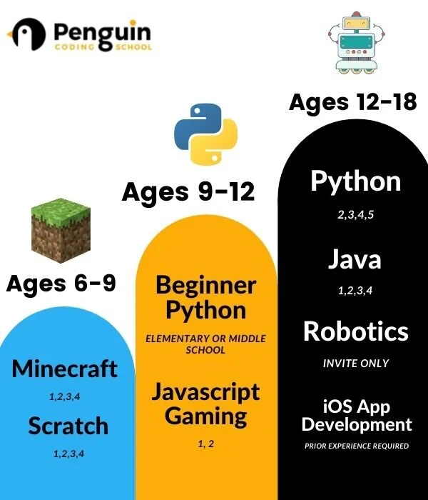
The Problem: A common complaint about Penguin Coding School’s Website is that it is confusing and hard to figure out what class to sign up for. Parents with little coding experience don’t know what the different classes teach and trying to decide which class is appropriate for their child is difficult. This affects Penguin Coding School’s conversion rate; we want more parents to sign up for classes and thus we need to make it easier for them to find the right one. And thus I set about trying to convey this information in one easy to understand graphic.
The Process
-

1. Gather Information
First, I had to understand which classes were offered for which ages. To do this, I went through the website and pieced together which class fit with certain ages. I put it all together in a Google Doc to keep track of it for the future.
-

2. Create a Rough Draft
Then, I began trying to create a breakdown of which class one should take based on children’s age. I find it easier to quickly hand draw ideas on an iPad rather than mocking them up on a computer. I had a few different attempts until I came up with something that I was content with.
-

3. Create a Mock-Up
This is when I went to Canva and transferred my rough draft into my first mock-up. I tried to utilize Penguin Coding School’s colors in my design but muted them to try to avoid oversaturation. This is my first design.
-

4. Submit for Review/Testing
Here is when I shared my design from step 3 with family, friends, co-workers, and my boss and collected feedback. I also took this opportunity to look at competitor’s designs for similar graphics, something I should have looked at earlier in Step 1 but I now know for later projects. Common critiques for my first graphic were that it looked too basic and rudimentary, and there was still a lot of text to read. With these critiques in mind, I began my next step.
-
5. Make Changes based on Feedback
So it was back to the drawing board! Going back to Canva, I created a new design; being mindful of how much text I was using, and how sophisticated it looked this time. I tried to emphasize the class names and ages and used bold colors this time. And from this, I came up with a new, stronger design.
-

6. Repeat steps 4 & 5 until Satisfied
And from there on, I just repeated steps 4 and 5 until I was satisfied with my results and had a final graphic that I felt portrayed our goal sufficiently. However, this graphic is not set in stone, and over time I will most likely come back to it and make changes based on the needs of the time.

Current Final Design for the Graphic