Piece 1:Website Design
The Beginning

On one of my first days at my new job this fall, my boss asked me to go through the current website and see what I thought of it. Since I was new and eager, this throw-away task resulted in a 5 page Google Doc with notes on every page of the website. For the most part, my critiques were rather subjective; what I thought would look better, but in some cases, I found broken links and missing images. Once I handed all of this to my boss, he glanced at it, and moved on setting me up with actual tasks. However, this deep dive has stuck with me, and now with a few months under my belt, I have come back to my first instinctive thoughts and built upon them.
A lot of my initial observations were rather uninformed; I wasn’t familiar with Squarespace or Sawyer (the scheduling tool) or even this company yet. However, after a few months playing around with all these new tools, I now have a better idea of what is both possible to change and how to better organize the website.
Re-designing the website is still an ongoing process as I become more fully integrated into this company, so some of the ideas have not reached fruition at the time I am writing this.
Below I have outlined the work I have done currently towards improving the company’s website and what I have learned along the way (though I’m still nowhere close to an expert.)
HubSpot Experiment
Sometime in late September, my boss announced that we would be switching our website, help-site, and email marketing all over to HubSpot. I was tasked with transferring the website into HubSpot’s Content Management System (CMS) and learning about their marketing opportunities and Customer Relationship Management (CRM). While my main task was just to transfer the website over as closely as I could between the two systems, I also wanted to clean up some aspects of the site along the way. Some areas I thought to focus on were:
Reducing long scroll times on our current website
Cleaning up image alignment and reducing image size
Reducing Footer length
Reducing Headline length and complexity
Introducing new pages to help organize and reduce confusion on our site (homepages based on location, a page helping parents choose classes and levels, etc.)
Unfortunately, about a week into this project, my boss announced that we wouldn’t be moving everything to HubSpot. This meant I only had a chance to work on a few pages and address the first point. Below, you can find the comparison to our current website on Squarespace, and the start of the website I was creating on HubSpot.
HubSpot (my incomplete version)

SquareSpace (current site)

Key Differences: Smaller Image sizes, better (straighter) alignment of the rows, clearer and shorter headline. Overall: less scroll time
Hubspot (my version)

SquareSpace (current site)

Key Differences: While there are still some excessive spaces in the HubSpot footer, overall it is shorter than the Square Space one and looks more appropriate for a footer.
Events Page
After the fake switch to HubSpot, I was tasked with making an events page on Squarespace. The first page I made, I used the built-in Events page template offered by Squarespace. However, my boss didn’t like the look of it, so I ended up creating my own.

Using the built in template had its pros and cons. Pros: it updated itself when events finished and kept track of the date itself. Cons: There was no way to add a Call To Action (CTA) button directly onto the first page of the events page and past events were not displayed (you can only see them when editing as pictured above).


My version of the Events page: CTA buttons and descriptions are right below the event. Past events show up at the bottom to show a more complete page. Finally, at the bottom I included a newsletter sign up. Pros: More inline with what my boss wanted. Cons: have to manually update when dates pass.
New and Improved List of Edits

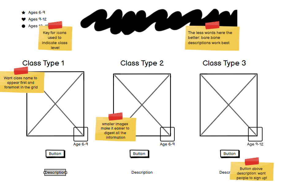
After almost two months on the job, and much more Squarespace experience, I decided to go back through the website and make a new list of suggestions based on priority. On this pass, I tried to focus more on actual changes that I knew were possible. My main goal was to clean up the website and reduce scroll time. The main issue is there is a lot of information to convey, yet little organization on how it is displayed. My time at the company has given me ideas on a solution to this problem.
Summary: my priority corrections were mostly in the Free Trial Pages. They were a mess; the slowest widget (Sawyer) was the top part of these pages and instead of any sorting, all the classes were just listed together. You had to scroll through 40 classes to finally get to any sort of organization. Changing this was simple, and in my wireframe below I address how it could look instead.
Overall, I already feel like I know much more about layouts and website design after only two months here. I think the change is obvious comparing the notes I took on this website at the beginning and the ones I’ve just taken.
Wireframes
Before doing a full website revamp, I learned (through research) that doing wireframes were a great way to convey your ideas for approval without having to change the actual website. So I decided to take some of the most problematic pages on our website (the free trial pages) and do a wireframe to convey my ideas to my boss for review.